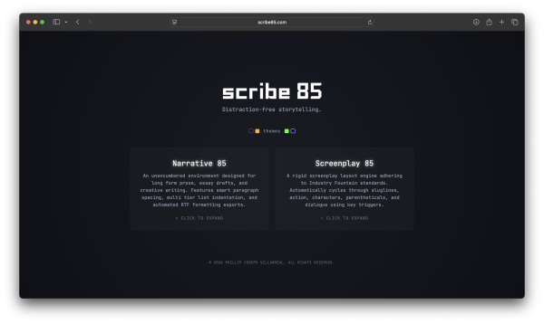
scribe85 is a web-based word processor built to eliminate cognitive friction for creative writers and screenwriters. Designed as a dark-mode digital sanctuary, scribe85 provides a simplified writing experience like it’s 1985.
By replacing heavy toolbars with an ambient focus state, proportion-driven responsive grids, and an ergonomic monospaced typography engine, scribe85 turns any browser into a tranquil, intentional writing canvas with four different retro monitor color schemes.
Project Requirements
scribe85 needed to nail a few different aspects to be the niche SaaS users could rely on. It needed to be:
- Free
- User Friendly
- Work instantaneously with no lag
- Require little-to-no formatting
- Subscription-free
- Easy to download documents
There are so many paid options that aren’t worth the money users pay. I wanted this to be an experience for users to easily create without any gate-keeping.
Speaking of gate-keeping, with good screenplay software requiring fees and subscriptions, I saw this as an opportunity to provide automatic screenplay formatting for free.
My Role
As the sole designer and engineer behind scribe85, I led the product lifecycle from initial UX concept to live URL. I designed an ambient focus state UI and ergonomic typography system to eliminate visual friction, conducted usability testing to iterate on workflow hierarchy, and built the front-end application with a secure static hosting pipeline.
Lead Product Designer: Defined end-to-end user experience, ambient focus UI mechanics, and persona frameworks
Front-End Engineer: Built responsive web app, custom markdown/export parser, and export engine
UX Researcher: Conducted usability testing with writers, collecting feedback for workspace iteration
Core Purpose
The Gap
As a writer, one of the biggest hurdles to overcome when I’m feeling creative or when I have a fresh idea is to actually sit down and initiate writing in the software of my choice.
When I open up a writing tool, the last things I want to think about are:
- Where am I storing my story?
- What’s the status of my subscription?
- What formatting am I supposed to use, and how?
- How do I use a dark mode?
Traditional web-based text editors are cluttered with persistent navigation bars, heavy toolbars, and invasive UI framing that constantly compete for a writer’s visual attention. Standard interfaces treat digital writing as an administrative task, overwhelming users with complex menus and rigid layouts that break creative flow and cause cognitive strain during long-form composition. Furthermore, many writing tools use some sort of subscription model or need to be installed locally.
The scribe85 Solution
scribe85 is a minimal, dark-mode digital sanctuary built to eliminate cognitive friction and honor the writer’s focus. Designed from concept to live deployment, scribe85 bridges the gap between distraction-free writing mechanics, responsive typographic ergonomics, and a secure production pipeline.
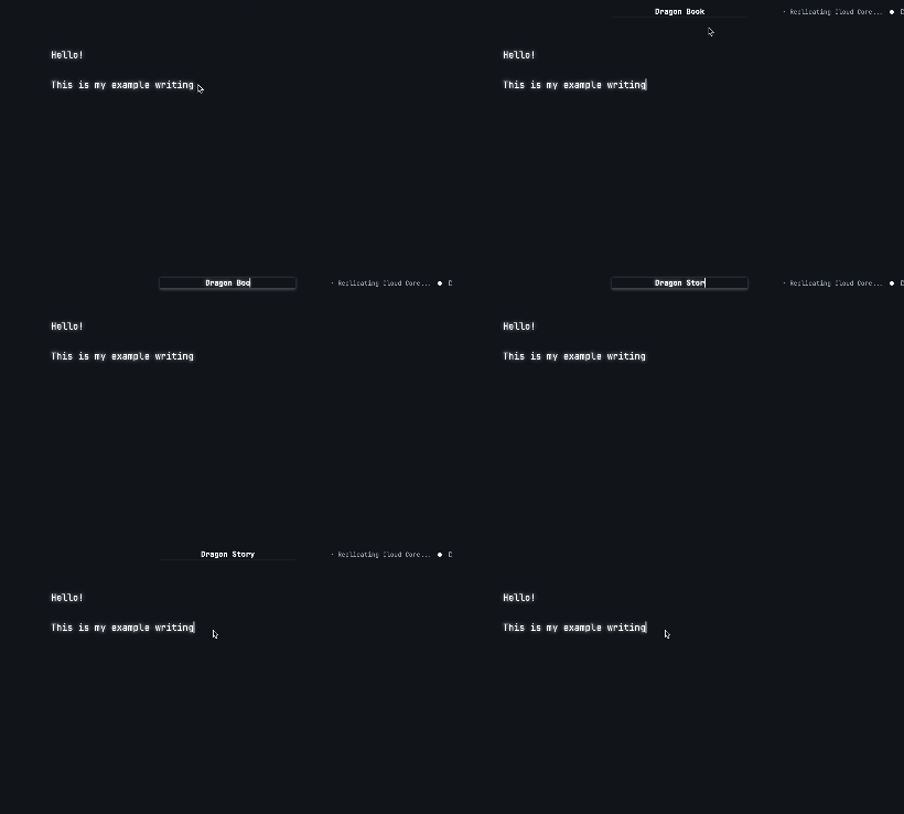
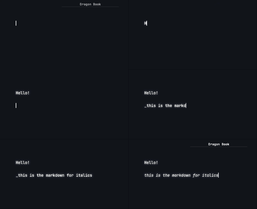
The Ambient Focus State grades the screen into darkness during active typing, returning instantly upon mouse or keyboard triggers.
A Proportion-Driven Layout enforces an optimal 60-75 characters per line (CPL) cap using fluid container queries.
scribe85’s Custom Export Engine provides custom RTF and TXT formatting logic, preserving indented and listed text as well as screenplay structure and custom styling down to the pixel.
Key Features
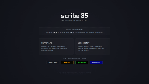
Themes
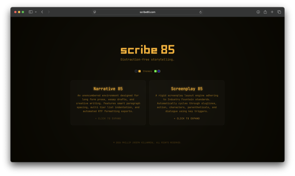
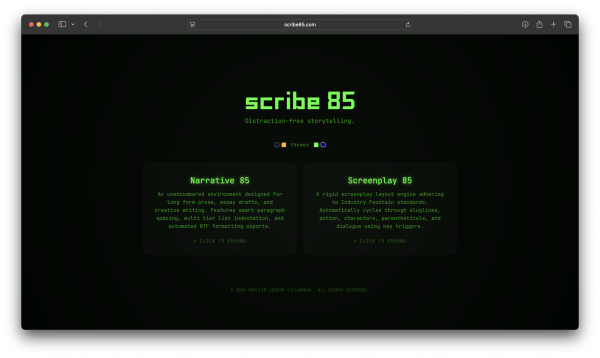
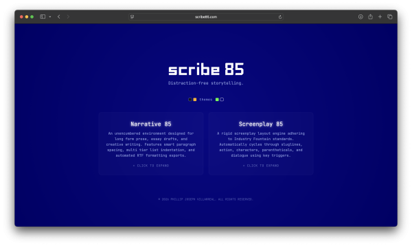
I wanted the user to have to option to pic from various retro-style color themes to simulate monitors from the 1980s.
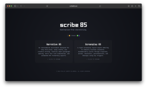
- Classic Dark is a simple dark indigo color with white text
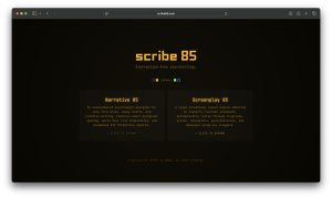
- Amber CRT gives a warm vibe, which is my personal favorite
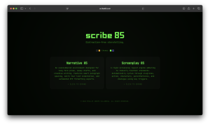
- Matrix Green gives a technical feeling and sharper contrast
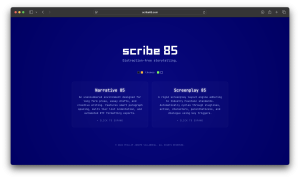
- Retro Cobalt simulates older television monitor setups
Lo-Fi Wireframes
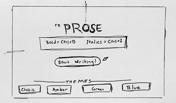
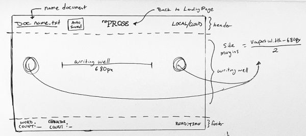
My low-fidelity wireframe was incredibly simple. I knew I wanted a landing page and a “well,” which is the usable writing space in a word processor canvas.
The main elements I wanted were:
- Logo
- How-to / tutorial
- Call to Action
- Theme selection
In the writing tool, itself, I wanted a very clean and simple user experience. The elements I wanted were:
- Writing well
- Document Name
- Word / Character count
- Logo / Button back to landing page
Lo-Fi Wireframes
My low-fidelity wireframe was incredibly simple. I knew I wanted a landing page and a “well,” which is the usable writing space in a word processor canvas.
The main elements I wanted were:
- Logo
- How-to / tutorial
- Call to Action
- Theme selection
In the writing tool, itself, I wanted a very clean and simple user experience. The elements I wanted were:
- Writing well
- Document Name
- Word / Character count
- Logo / Button back to landing page
Key Features
Themes
I wanted the user to have to option to pic from various retro-style color themes to simulate monitors from the 1980s.
Classic Dark is a simple dark indigo color with white text
Amber CRT gives a warm vibe, which is my personal favorite
Matrix Green gives a technical feeling and sharper contrast
Retro Cobalt is a fully cobalt screen with white text, simulating older television monitor setups
My Process
Usability Iteration: Conducted testing sessions with creative authors and screenwriters, synthesizing raw feedback into structured UX action items—such as rebalancing page visual hierarchy, adding document title edit affordances, and adding context-aware shortcut drawers.
Persona Development: Defined target user archetypes (The Distraction-Free Novelist and The Structured Screenwriter) to balance minimal prose writing with strict screenplay formatting needs.
Ambient Focus Mechanics: Designed the core distraction-free micro-interaction model where top and bottom UI chrome automatically degrade into dark space during active typing.
Ergonomic Typography System: Engineered a high-legibility typographic scale utilizing monospaced typefaces (Courier Prime, JetBrains Mono), generous 1.6× line-heights, and a strict 60–75 character-per-line (CPL) container boundary to reduce eye strain.
Custom UI Asset System: Crafted lightweight, unified inline SVG vector icons and custom theme palettes (Classic Dark, Amber CRT, Matrix Green, Retro Cobalt) to maintain a zero-bloat visual footprint.

Responsive Layout Engine: Built proportion-driven CSS container queries and flex/grid systems that adapt seamlessly across mobile, tablet, and wide desktop displays.
Custom Parser & Export Engine: Overhauled input event handlers for real-time markdown styling and built custom export logic to preserve complex screenplay formatting (indents, tab stops) in clean TXT and RTF downloads.
Live Domain & Pipeline Management: Managed the end-to-end hosting pipeline—mapping apex A-records and CNAME subdomains to GitHub Pages, configuring automated CNAME bindings, and enforcing SSL/TLS encryption via Let’s Encrypt for a secure live web app context.
User Testing
Visual Hierarchy
Mode selectors (Narrative vs. Screenplay) dominated the top-level view, distracting from immediate writing.
Rebalanced Weight: Scaled down top controls to prioritize the canvas while keeping mode toggling intuitive and lightweight.
Affordance & Identity
Users were unsure whether the top document title was editable without visual hints.
Interactive Indicator: Integrated subtle hover states, a micro-pencil SVG affordance, and inline focus styling.
Markdown Reliability
In-line bold/italics shortcuts failed in edge cases, and line-breaks on Return were inconsistent.
Instruction Guidance
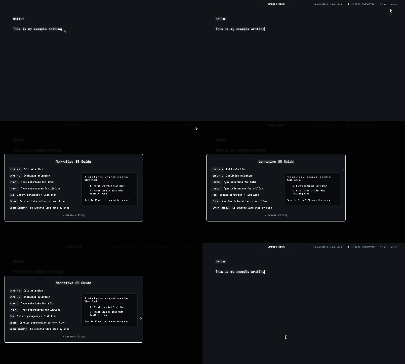
Writers wanted access to key formatting shortcuts without leaving the flow or opening separate tabs.
User Testing
Visual Hierarchy
Mode selectors (Narrative vs. Screenplay) dominated the top-level view, distracting from immediate writing.
Rebalanced Weight: Scaled down top controls to prioritize the canvas while keeping mode toggling intuitive and lightweight.
Affordance & Identity
Users were unsure whether the top document title was editable without visual hints.
Interactive Indicator: Integrated subtle hover states, a micro-pencil SVG affordance, and inline focus styling.
Markdown Reliability
In-line bold/italics shortcuts failed in edge cases, and line-breaks on Return were inconsistent.
Onboarding Guidance
Writers wanted access to key formatting shortcuts without leaving the flow or opening separate tabs.