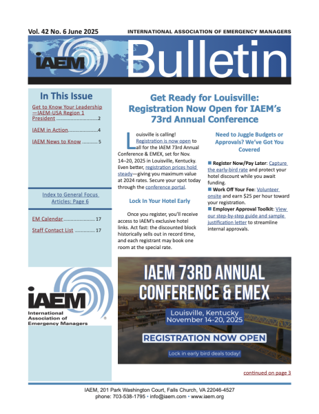
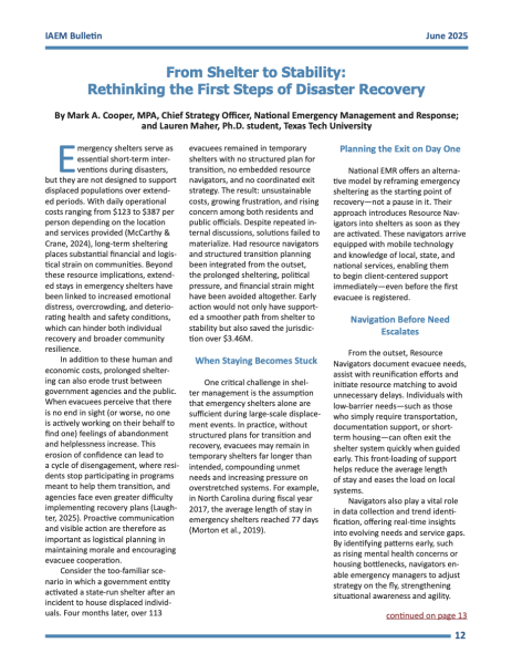
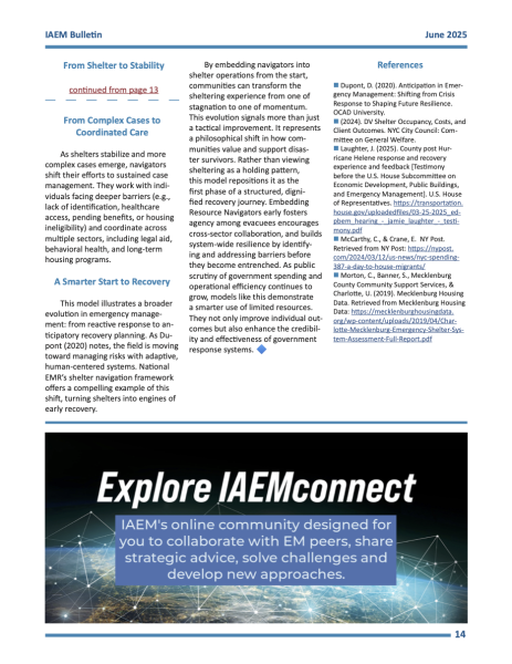
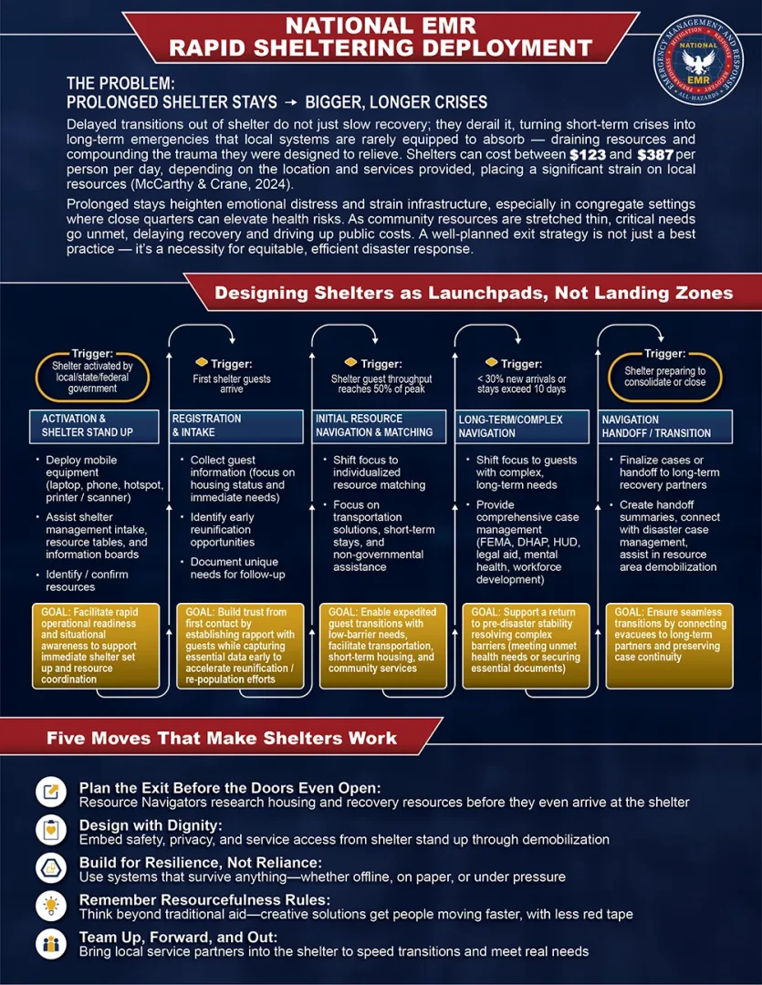
I had the honor of designing a large infographic on behalf of National EMR for display in a news letter called the IAEM Bulletin. The target audience for this resource are emergency management professionals, and my objective was to outline:
The issues National EMR will solve
The full process of how they accomplish this
Tips shared from their own experience
June 2025 IAEM Bulletin Editorial
I had the honor of designing a large infographic on behalf of National EMR for display in a news letter called the IAEM Bulletin. The target audience for this resource are emergency management professionals, and my objective was to outline:
The issues National EMR will solve
The full process of how they accomplish this
Tips shared from their own experience
Objectives
The design parameters for this informational piece were:
National EMR branding
Informative over promotional
Explain emergency response challenges that National EMR will address
Timeline showing their typical process
Share tips directly from National EMR experience in the field
Objectives
The design parameters for this informational piece were:
National EMR branding
Informative over promotional
Explain emergency response challenges that National EMR will address
Roadmap showing their typical process
Share tips directly from National EMR experience in the field
Drafts and Wireframes
There was a lot of information that needed to be represented in this design. On top of that, there was an entire article being written around the full-page graphic. The creation process had to be iterative and flexible.
I focused on the roadmap since this was the most complicated aspect of the design. I first found my minimum readable font size, then set to working the roadmap into different configurations. I then placed it over my artboards so I could best work out the space for the rest of the content.
The Challenges and Tips sections were simply text and maybe icons. I see text as having similar fluidity to water; it takes up the space that’s available seeking a level state. With the roadmaps in place in their respective iterations, I formatted the other two sections into the spaces that remained.
Drafts and Wireframes
There was a lot of information that needed to be represented in this design. On top of that, there was an entire article being written around the full-page graphic. The creation process had to be iterative and flexible.
I focused on the roadmap since this was the most complicated aspect of the design. I first found my minimum readable font size, then set to working the roadmap into different configurations. I then placed it over my artboards so I could best work out the space for the rest of the content.
The Challenges and Tips sections were simply text and maybe icons. I see text as having similar fluidity to water; it takes up the space that’s available seeking a level state. With the roadmaps in place in their respective iterations, I formatted the other two sections into the spaces that remained.
Final Design
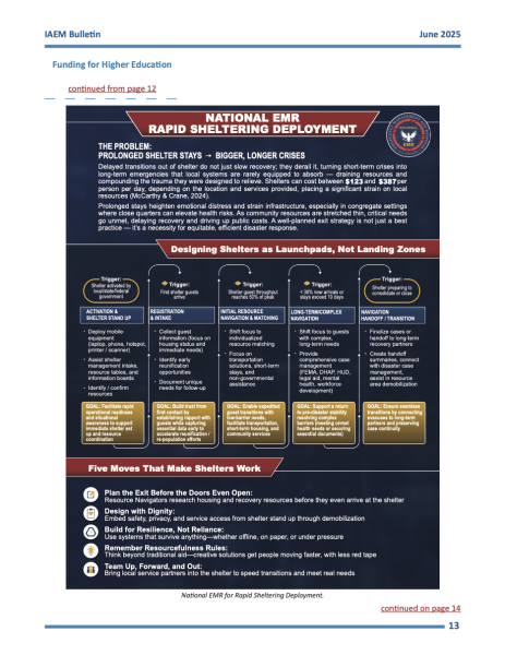
After several iterations and content adjustments, I delivered this final product.
I used a background image with blur to give some visual movement in the background of the entire sheet.
I used the branded National EMR colors throughout the design, adding shadow to pull out the visual elements and give them some depth.
I used National EMR’s gold hue to pull the eye towards the center of the design, providing a secondary priority in the visual hierarchy of the page. The gold was specifically used for the portions of the roadmap that called for pivotal attention.
I maintained the top-down hierarchy by ensuring the level 1 heading used larger, heavier text in the against a strong red background containing box.
While the roadmap is a typically a linear path through time, it can be folded and curved to fit any area. For this design, I folded it like a spring, moving vertically from top to bottom and to the right for the next section.
Lastly, I split the tips section into five distinct, titled items, each with their own specialized icon. These icons served to give quick shorthand visual representation of each tip. I used the navy blue and gold hues to give visual interest, but avoided so they wouldn’t be overwhelming.
Final Design
After several iterations and content adjustments, I delivered this final product.
I used a background image with blur to give some visual movement in the background of the entire sheet.
I used the branded National EMR colors throughout the design, adding shadow to pull out the visual elements and give them some depth.
I used National EMR’s gold hue to pull the eye towards the center of the design, providing a secondary priority in the visual hierarchy of the page. The gold was specifically used for the portions of the roadmap that called for pivotal attention.
I maintained the top-down hierarchy by ensuring the level 1 heading used larger, heavier text in the against a strong red background containing box.
While the roadmap is a typically a linear path through time, it can be folded and curved to fit any area. For this design, I folded it like a spring, moving vertically from top to bottom and to the right for the next section.
Lastly, I split the tips section into five distinct, titled items, each with their own specialized icon. These icons served to give quick shorthand visual representation of each tip. I used the navy blue and gold hues to give visual interest, but avoided so they wouldn’t be overwhelming.